System
Two platforms, one renewal risk model
The risk score initially lived only inside the Renewals Console as a deal-level widget. I negotiated a strategic pivot with the PM to also surface it on the Renewals Console Home — giving Renewal Sellers and Customer Success teams managing $200M+ in deals across 150+ countries full visibility across their entire portfolio, not just the deals they had already opened.
Platform 01 — Renewals Console
Individual deal mgmt tool
Platform 02 — Renewals Console Home
Overview of deals, reporting, actions
My Role
UX Designer & UX Researcher
As UX Lead & Research Lead, I independently proposed and owned the entire evaluative research lifecycle end to end — from framing requirements and building the prototypes, through planning and running usability testing myself, to synthesizing findings and presenting recommendations directly to stakeholders.
Role 01 — UX Designer
- Leading end-to-end project
- Creating prototypes
- Analyzing usability testing
- Presenting analysis report to stakeholders
- Hand-off to the dev team
Role 02 — UX Researcher
- Planning the usability testing
- Recruiting participants
- Arranging the interview schedules
- Conducting usability testings
- Developing testing scripts & standardized note-taking formats
Design Approach
Initial Requirements → Design Iteration → Prototype
Business goal: maximize renewal Annual Recurring Revenue (ARR) across enterprise accounts. While the initial directive was simply "increase renewals," research showed that surfacing and predicting renewal risk was the more direct lever — so the requirements evolved from a simple deal-level widget flagging what caused a high-risk score (the MVP scope), to a dashboard-level experience showing explicit root causes and prescriptive next steps (the senior UX pivot), to a footprint expanded from a hidden console widget onto the Renewals Console Home for daily visibility (the platform expansion).
Initial Requirements
Focus on deal-level info, popup interactions, and initial design exploration.
Design Iteration
Expanded to dashboard-level views, clear next actions, and color-coded status indicators.
Prototype
Final interactive prototype featuring streamlined user flows and key UX improvements (8 tasks).
Design Validation
The trust barrier
Our pre-launch research with 10 global participants (some with up to 26 years of tenure at Cisco) revealed a critical systemic issue: users ignored the Renewal Risk column because they defaulted to distrusting the AI model. Instead of acting on the score, they manually bypassed the ecosystem to verify data directly with customers — creating major operational inefficiencies. I initially framed this as a usability problem, but I quickly learned the bigger issue wasn't usability — it was whether users trusted the risk score.
Key Takeaways
- Overall, all the roles said that the Connected Insights popup is very useful even though they have different use cases. Their overall usefulness rating is 4.6.
- When participants were asked how they would see more detailed information on the Renewal Risk, they mostly clicked the deal link rather than clicking the Connected Insights popup.
- Most participants found Renewal Risk Detail information, Action Plan, and Contacts information helpful. However, there are still places for improvement such as labeling or connections between information.
Findings & Strategic UX Solutions
Five friction points, Five design decisions
Finding 1
From "black box" to explainable AI (XAI)
The friction: users hesitated to act on high-risk flags because they didn't know why the score was generated.
and that it's linked to the customer success dashboard and there is some telemetric going wrong, like taking an option and everything, but it's not that accurate. So, what I'm doing is, I just go to costumer or partner to ask..
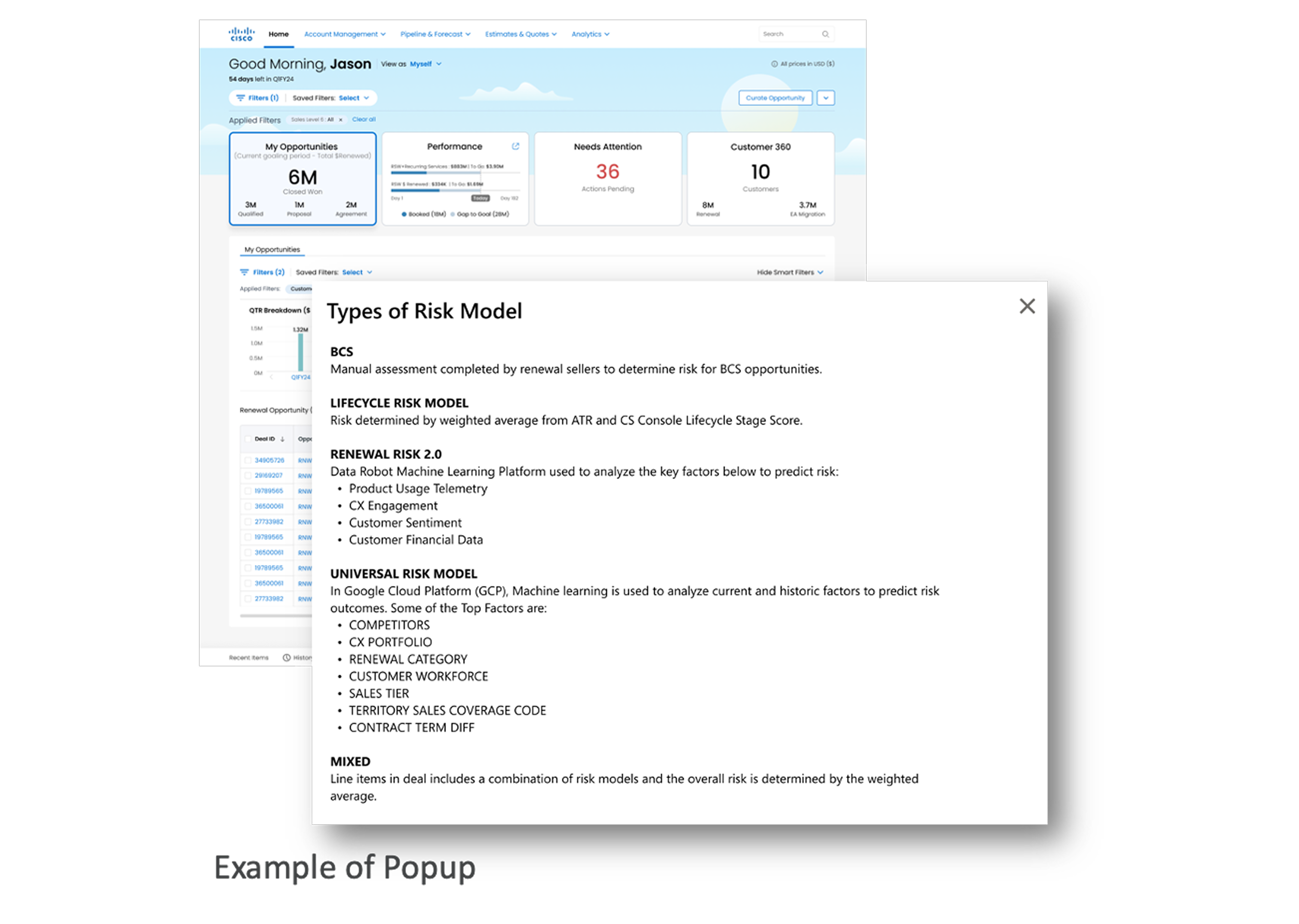
Aiming to build trust in the risk data, I moved beyond raw numbers to prioritize model explainability — designing a framework that details how the model works, displaying specific algorithmic risk drivers combined with collaborative history (e.g., Customer Pulse) for clear visibility across all user roles.
By transforming an isolated number into an explained narrative, we established immediate psychological safety and data credibility.
Finding 2
Standardizing the interaction pattern (mental models)
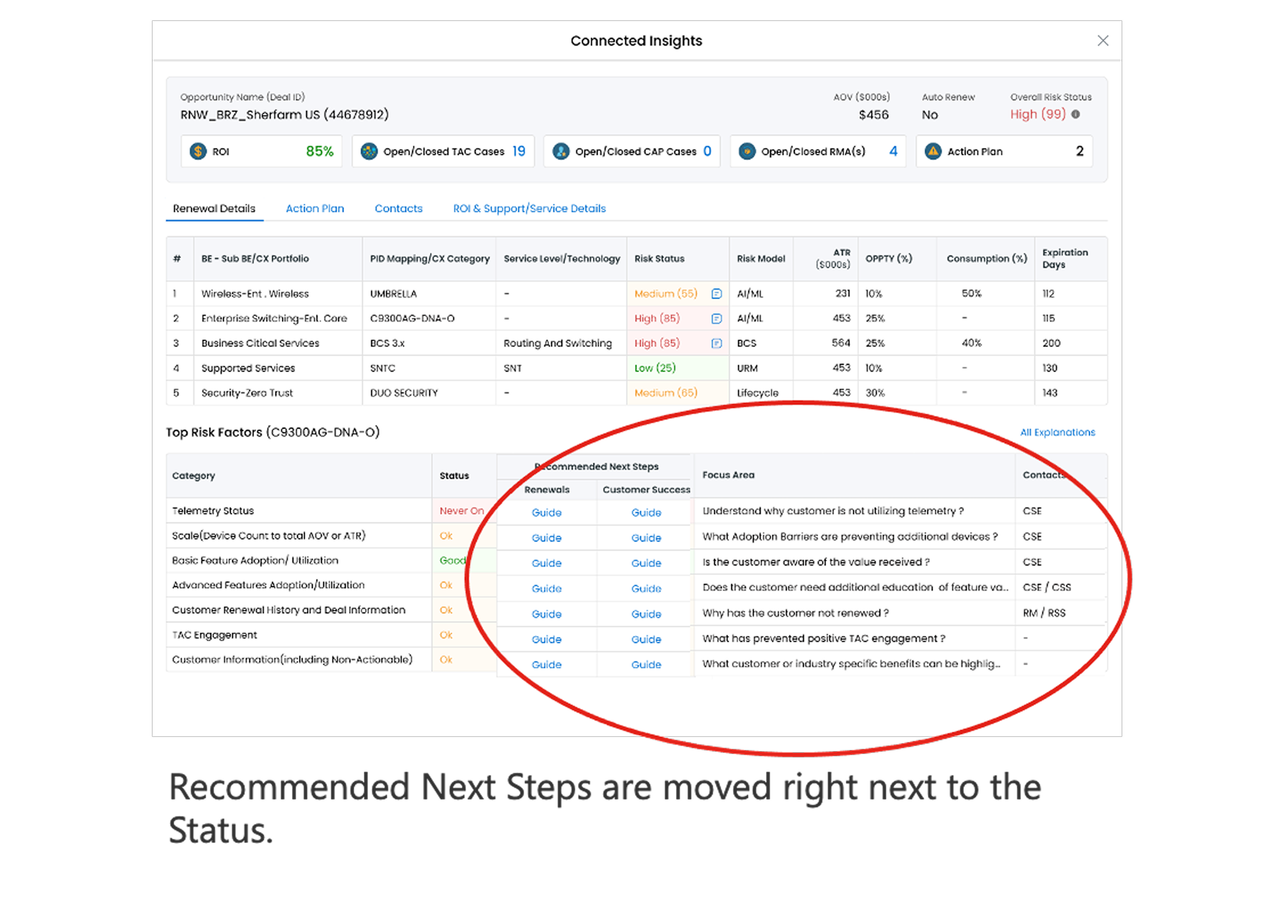
The friction: in the Top Risk Factors table, users repeatedly tried to click directly on the status labels (High/Medium), which disrupted the console's existing interaction model.
I would then probably go to status and click on see if, if they were highlight hyperlinked or something to.
Instead of forcing users to adapt to the UI, I adapted the UI to their mental model — establishing a predictable, strict interactive sequence: Status → Focus Area → Who to Contact → Actionable Guide.
Unified the interface's behavior pattern, drastically lowering cognitive load and eliminating navigation errors during critical workflows.
Finding 3
From habit-driven navigation to contextual discovery
The friction: Users instinctively clicked the Deal ID or Opportunity Name rather than the designated status bubble to learn more about the Renewal Risk, driven by their deeply ingrained habit of accessing detailed information through traditional console pathways.
I would click into the opportunity. I don't know, probably on the deal ID, or the opportunity name.
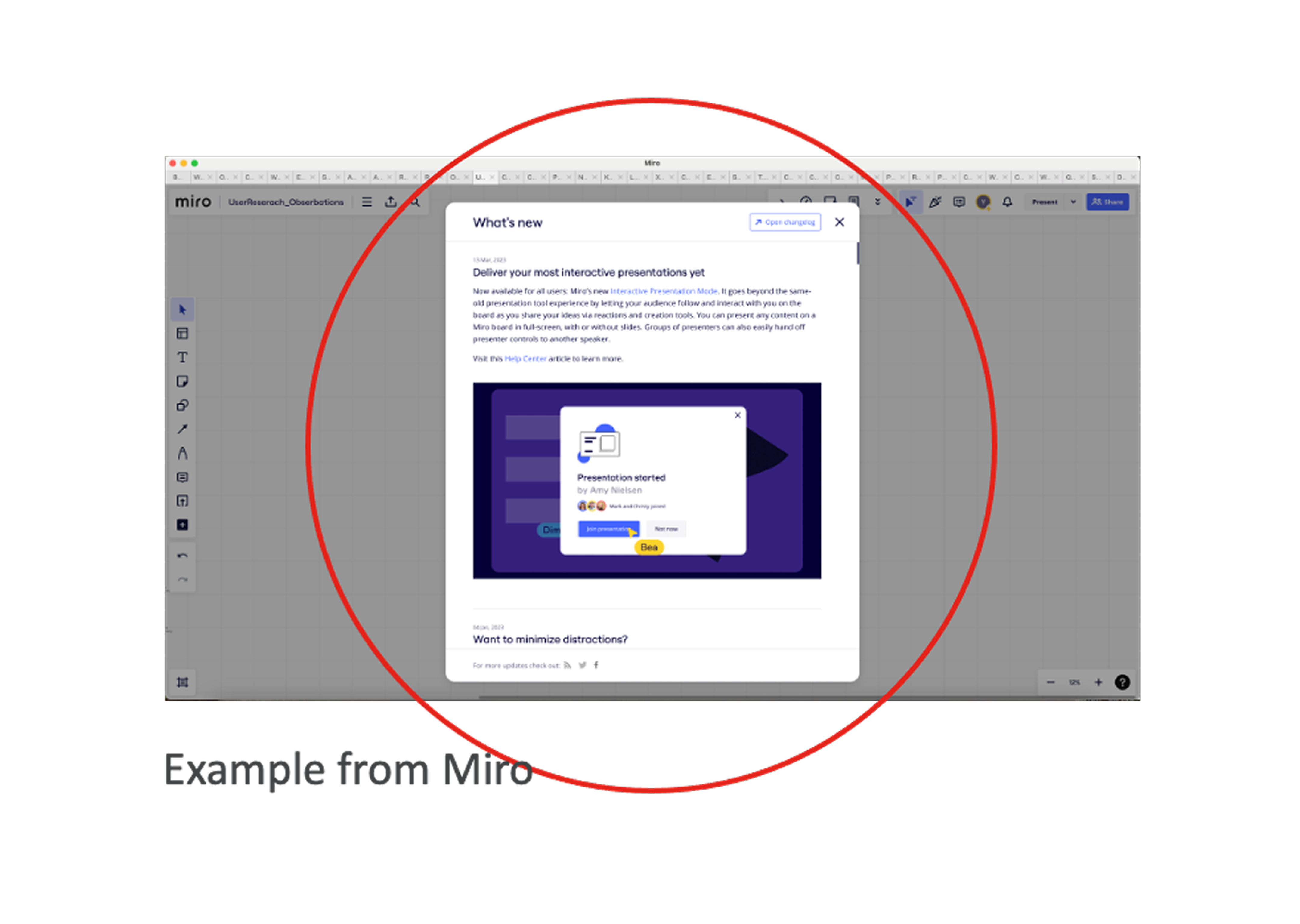
Recognizing that users rely heavily on existing navigation habits and cannot immediately adapt to new UI elements, I advocated for an empathetic, friction-free onboarding framework. Rather than forcing users to guess or altering the core data structure, I designed an intuitive, in-system "What's New" quick-guide session triggered upon login. This context-aware guidance directly bridges the gap between familiar navigation paths and newly introduced features without disrupting their active workflows.
Eliminated the learning curve for the new interaction model and significantly accelerated features adoption, while bypassing the need for costly and time-consuming global training sessions.
Finding 4
Proposing terminology standardization in the design system
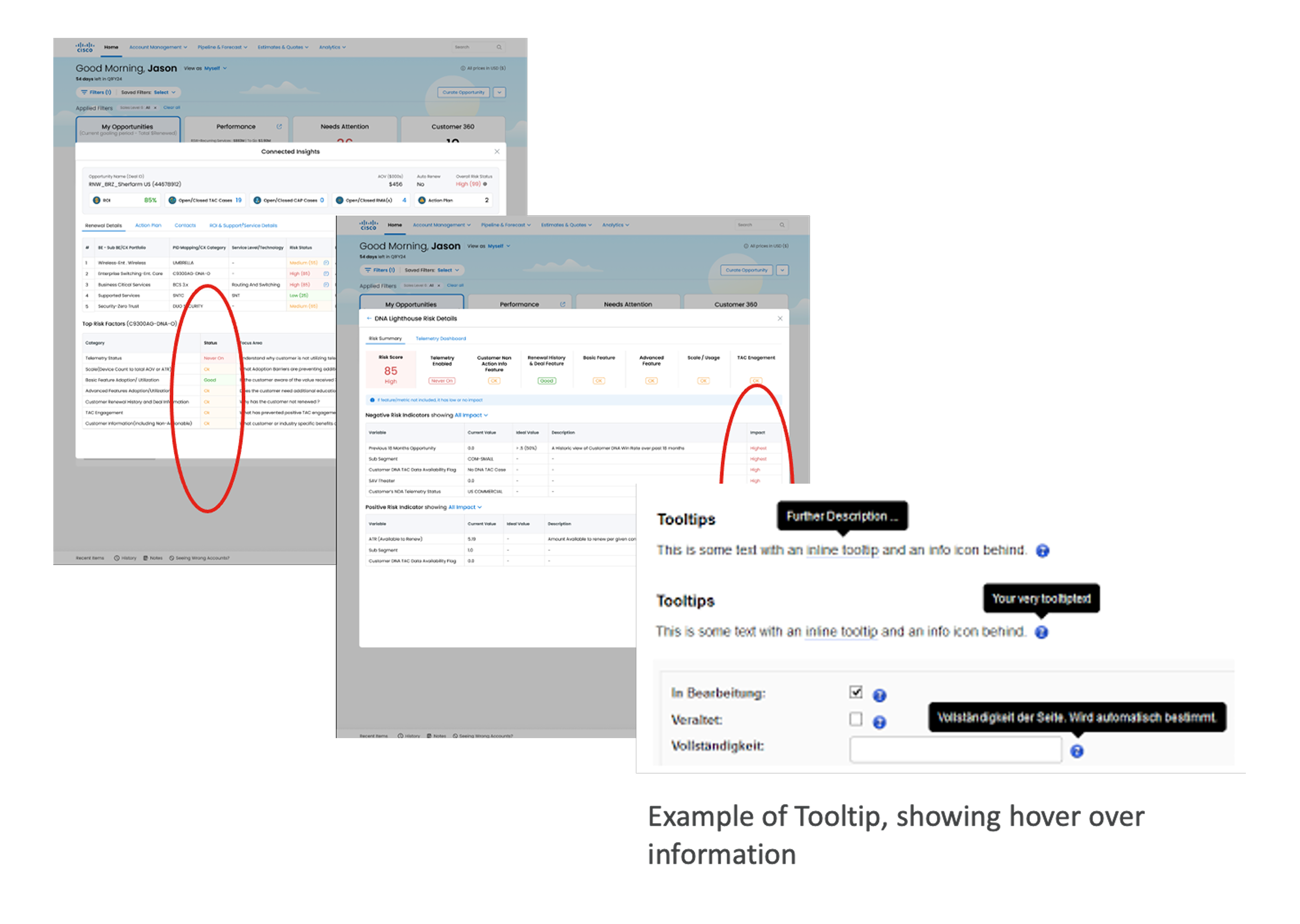
The friction: the console suffered from fragmented vocabulary across different roles (e.g., "Ok"/"Good" in one section, "High"/"Highest" in another), causing user confusion.
Looking at the platform's long-term scalability, I partnered with a UX researcher to propose a standardized system — prioritizing user-friendly information delivery with inline tooltips and hover-states that explain complex definitions natively.
Avoided costly, disruptive global training sessions by building "vocabulary standardization" directly into the design system component.
Finding 5
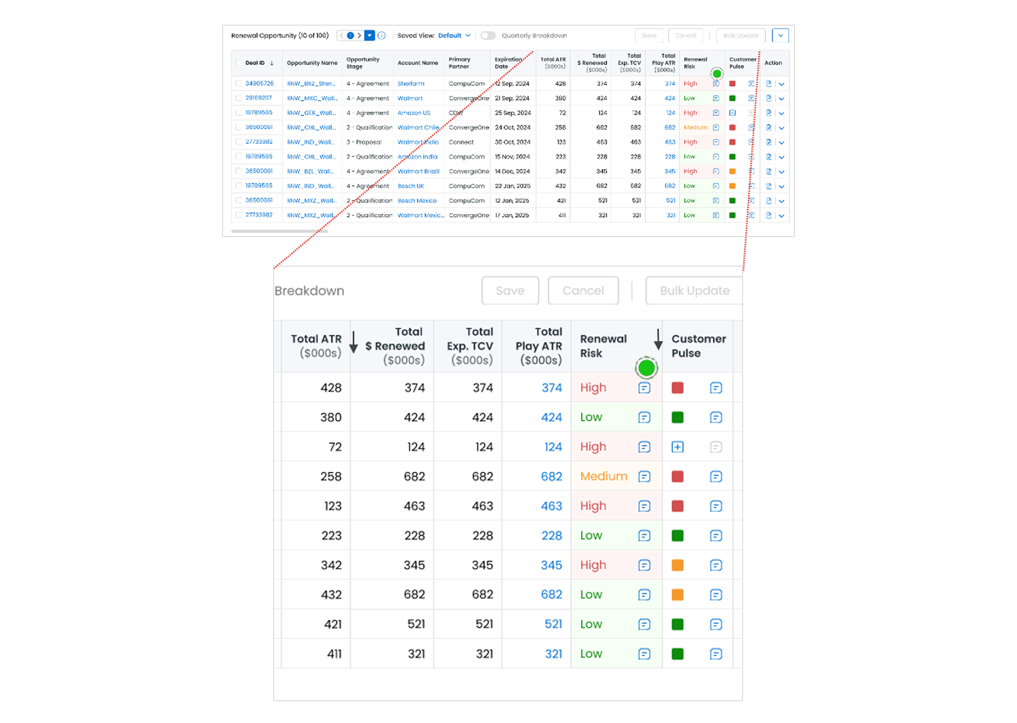
Workflow optimization via quick-sorting
The friction: 70% of renewal sellers prioritized their daily workflows using the same three vectors — high ATR (Amount to Renew), earliest expiration date, and Renewal Risk — but had to manually scan the table every time.
I think that Ah.. let me see, is there a way to filter or to order the high to low? That would be helpful.
Proposed introducing a localized quick-sort algorithm and custom column reordering panel directly inside both the console and the popup, mapping perfectly to users' operational priorities.
Drastically reduced manual data scanning, driving an expected 20% efficiency gain in users' daily workflows.
Cross-Functional Leadership & Stakeholder Alignment
Navigating constraints to drive product strategy
When research revealed that users were missing the popup entirely due to deeply ingrained habits, I faced a major product constraint: no native in-app guidance framework at launch. Instead of letting the user experience suffer, I stepped up to lead a cross-functional strategy with Product Management and the Business Operations team.
Short-term mitigation
- Designed and negotiated a Phased Geo-Rollout Strategy
- Paired the rollout with targeted video micro-training for the release
Long-term roadmap
- Leveraged this user friction to build a business case for a permanent in-product guidance framework
- Targeted for the following quarter
Every participant passed UAT
The true success of this project lies in its future-proofing — shifting the narrative from "how do we show a popup?" to "how do we design scalability and trust into an AI model?"
The Bigger Picture & Design Scalability
Designing scalability and trust, not just a popup
This project taught me that my role is not just to design what the PM asks for. I can also suggest a better direction for users, test it, and use the results to support my design decisions.
We also discovered a bigger user need through testing that we hadn't noticed before. That taught me how valuable even small validation sessions can be.
I also learned how to use prototypes and usability testing to get stakeholders aligned and guide the design direction.